The Case of the Moving Icons

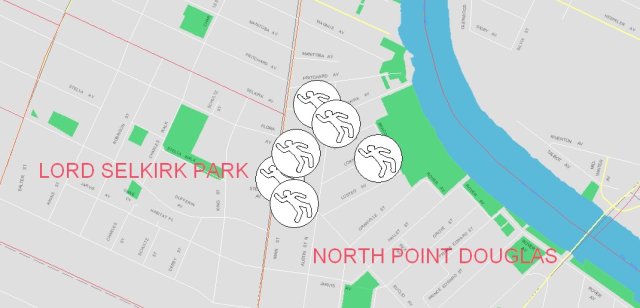
A few weeks ago I looked at  the Crimestat map for the North Point Douglas community, specifically the icons representing homicides.

The next day I looked at them again and although going strictly from memory, it appeared they had moved.

That caused me to “save” a few images over a period of days just to track whether or not the position of the icons was indeed altered from one day to the next.  It turned out that the problem was Crimestat’s and not mine.

The following maps, saved on different dates, are for the North Point Douglas community.  They clearly show that the cluster of 6 homicides are not stationary.  As you will note, the icons change location from day-to-day.

Map. 1  (November 28 2011)

Map 2  (December 1st. 2011)

Map 3  (December 3rd. 2011)

This caused me to click on the Contact Us button on the Crimestat Website.  I sent them the following message on November 27th:  “I notice that the icons for the cluster of homicides in North Point Douglas change positions from day-to-day.  Why would that be?”   Having received no reply I sent a reminder on December 1st,  still no reply.

I’m assuming the City does not know the answer or surely they would have responded by now or perhaps it is of no consequence to them.  The fact is, though, the icons, like the victims they represent, should not be moving to the degree they are (i.e. almost into another community) because, otherwise, the map is not an accurate representation.

Is there anyone out there who has expertise with geospatial analysis software that could explain what is happening here?  Perhaps we can send a few hints on to the City to assist them in rectifying this problem.

Winnipeg’s Bloodiest Neighbourhoods

In 2004 there were 34 homicides committed in the City of Winnipeg.

It appears that number will be surpassed this year.  There are already 34 homicides reported through the first 10 months of 2011.

The purpose of this post is to provide a breakdown of where in Winnipeg homicides are most prevalent.

The first table shows the breakdown of homicides by police district.

POLICE DISTRICT NUMBER OF
 HOMICIDES
% OF TOTAL
1 11 32%
2 1 3%
3 16 47%
East 2 6%
6 4 12%
Total 34 100%

The next table looks at homicides broken down by electoral ward and shows that 3 electoral wards account for almost 80% of all homicides in Winnipeg.  It is of interest to note that these 3 wards are the lowest in terms of annual household income, trailing the other 13 electoral wards by an average of  $22,000.00.

ELECTORAL WARD Average Household Income NUMBER OF HOMICIDES % of Total
Mynarski $48,920.00 15 44%
Daniel McIntyre $43,367.00 7 20.5%
Point
Douglas
$49,971.00 5 15%
All other (12)
wards combined
$69,552.00 7 20.5%

There are a total of 236 neighbourhoods identified in Winnipeg each with its own geographical footprint.  The table below shows that 57% of all homicides in Winnipeg so far in 2011 occurred in 6 of those 236 neighbourhoods.  (Apart from those listed in the table  there are 15 other neighbourhoods that reported 1 homicide, the remaining 215 neighbourhoods reported no homicides).

This table shows the number of homicides broken down by neighbourhood.

NEIGHBOURHOOD POLICE DISTRICT NUMBER %OF TOTAL
North Point
Douglas
3 6 18%
William
Whyte
3 4 12%
Centennial 1 3 9%
Lord
Selkirk Park
3 2 6%
St. John’s 3 2 6%
Central
Park
1 2 6%
15 others
with 1 homicide each
15 43%
Total 34 100%